
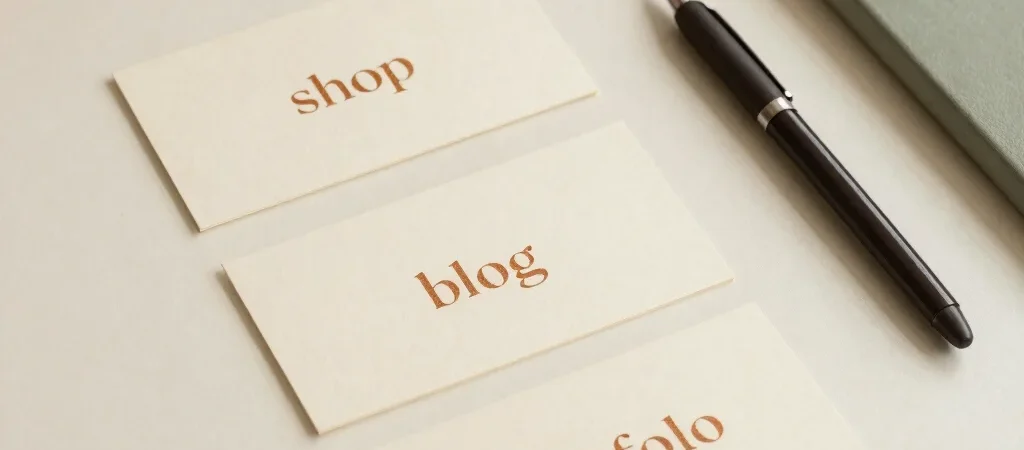
A visitor lands on your site looking for a specific thing: a digital product, a useful blog note, or examples of your professional work. If all three destinations compete for attention on the first screen, the visitor has to stop and interpret the page before they can choose. A clean layout should make that choice feel simple.
Start with the three paths
Give the shop, blog, and portfolio distinct names in your main navigation. “Shop,” “Blog,” and “Portfolio” are more immediately useful than clever labels whose meaning visitors have to guess. If the portfolio is password protected, say so beside the link rather than waiting until someone reaches a locked page.
The homepage can introduce all three without giving them equal visual weight. Choose one primary action, then keep the other destinations easy to find in the navigation or a short set of links. The right hierarchy depends on what you want visitors to do first, not on which page took the longest to build.
Make each page earn its space
A shop landing page should help people browse products, while the blog should make its articles easy to scan. A portfolio entry point has a different job: tell visitors what the area contains and explain the password requirement. Repeating the same broad introduction on every page blurs those differences.
Keep the visual system consistent so the site feels like one place. Warm cream surfaces, deep espresso type, and a restrained caramel accent can carry across all three destinations, while page headings and brief descriptions clarify where visitors are. Consistency should support orientation, not make every page look interchangeable.
Check the first click
Ask someone who has not seen the site to find one digital product, open a blog note, and locate the professional work. Watch where they pause, especially around navigation labels and any portfolio password message. A small wording change can save a visitor from clicking into the wrong place.
Before publishing, check the same routes on a narrow screen, where navigation may collapse and the homepage has less room to explain itself. Keep the labels direct and the portfolio access note visible at the point of choice. The best structure is the one that lets people arrive, recognize their destination, and move on.